|
ROLE
Tastemaking, Prototyping, Wireframing, UI, Animation, User Testing |
TIMEFRAME
6 Months |
PLATFORM
Fire OS |
TOOLS
Sketch, Illustrator, Photoshop, After Effects |
Out with the old, in with a home makeover that truly highlights what Amazon digital services has to offer: Content, content, and more content. The current Home experience was hard for the customer to discover new and relevant content and never felt personalized. Codenamed Bellini, I had the amazing opportunity to fully redesign the Fire OS Home experience from the ground up.
Tastemaking / Ideation
Magazines as the influence
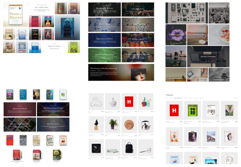
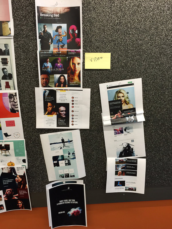
How do we make Amazon's wide range of content more discoverable to the user? How do we make the content living and tailored to the user's behavior better? Our team was inspired by grids in magazines. Great magazines and periodicals have wonderful staggered layouts that place importance on the content itself in a beautiful, meaningful way. This lead to cutting up magazines, printing beautiful staggered layouts on the web, and pinning them to corkboards.
Visual Concepts and Tastemaking
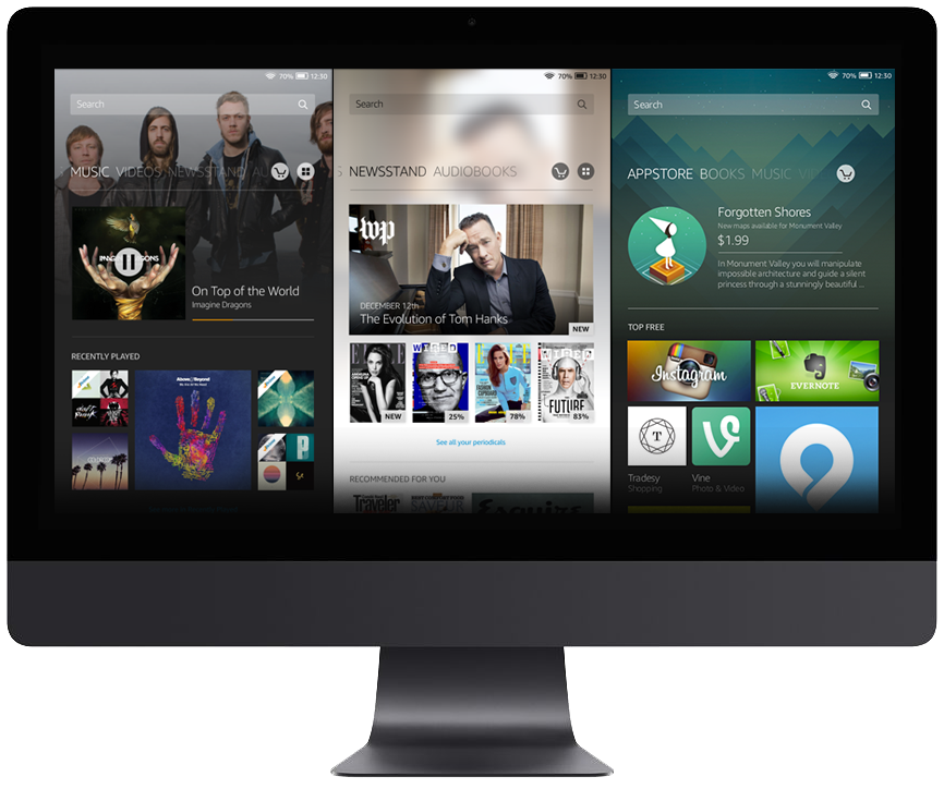
Once I arrived on an overall theme, how do I translate it to Fire tablets and get the team excited on our new path? I then designed visual concepts to get approval from stakeholders and buy-in from the team. There were numerous grid explorations and tweaks to determine the overall visual direction. Buy-in from the user is the most important, so working with a Design Technologist, we quickly built a working prototype and conducted user tests. Users were unanimously in love with the new layouts, found it intuitive to navigate, and thus it was full speed ahead.
Wireframes and Flows
Home Experience
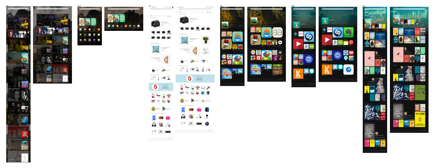
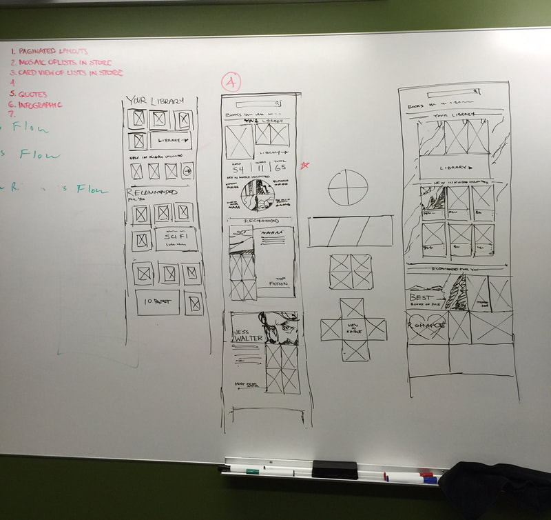
Since visual direction has been validated, it was time to define interaction and grids layouts. I created various spec docs, style guides, and interaction flows for all the tablet variants. Above is a small sample of what I designed.
First Run Experience
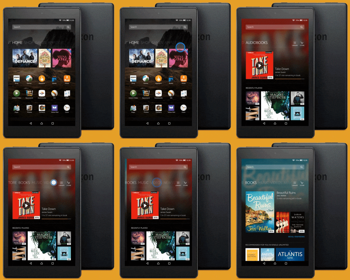
The FRE was created to get new and existing users familiarized with the new Home layout. Above is a small sample of the flow for an existing user. The flow was prototyped then validated through user-testing. After several iterations, we landed on a version most users understood. I made a flow that was clear, easy to follow and didn't look technical.
Other key components I worked on
|
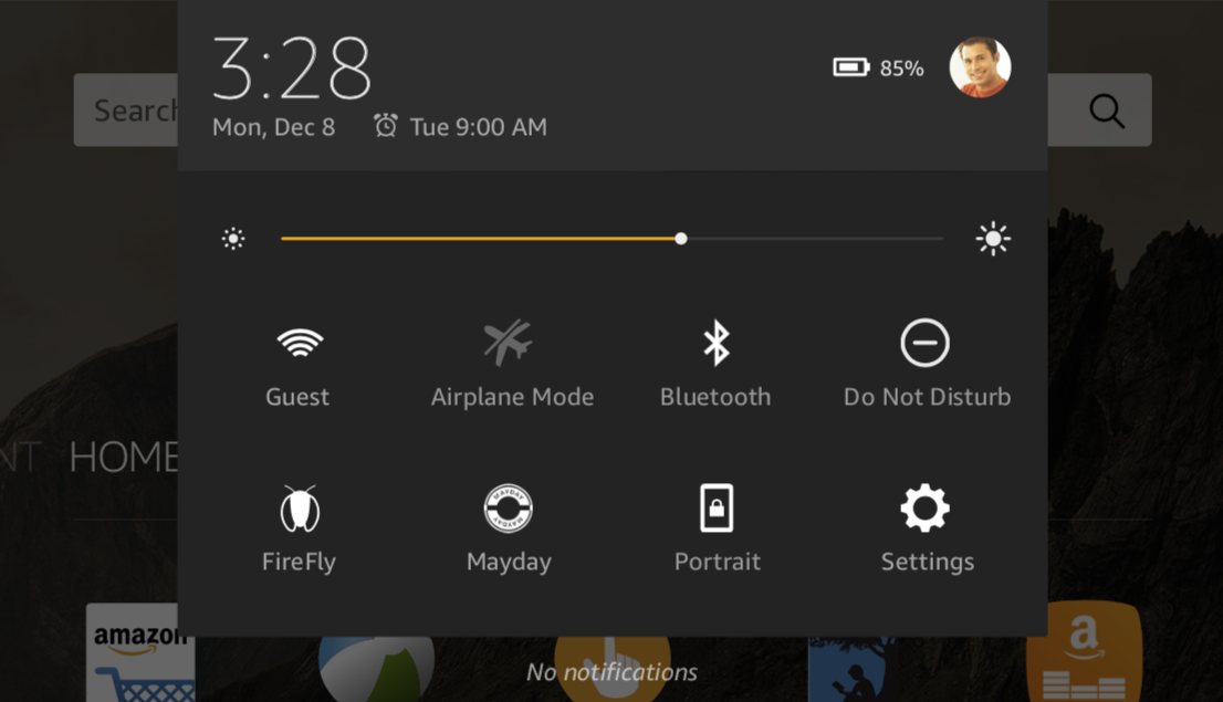
I wireframed and created flows for Quick Actions tray. This included layout, which settings to expose and ixd for Bluetooth settings.
I wireframed the status bar layout, placement of system and notification icons.
|
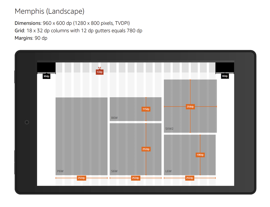
I wireframed and created specs on the landscape view layouts for all tablet variants. Due to the change in grid columns, switching orientation is more than just rotating the layout; much needed to be re-arranged.
|
|
Conclusion
This was one of the highlights of my career as a UX Designer. It's very rare a designer has the privilege of successfully tackling so many key consumer-facing features for a top-selling product. I had this opportunity and cherish it fondly... Mostly because of the skilled designers and managers at Amazon Digital Design Group working along side me; the late nights, the brilliant brainstorming sessions we had, and how much I learned about creating pixel-perfect grid layouts :)
|
